Comic Toning vs. Shading – Madison Hawthorne

Hello all sorry for the delay I had some computers issues.

I went to Dragon-Con, unfortunately I do not have any pictures to show from the art gallery as they were not allowed. However, I was able to sit down and talk with comic artist Dusty Higgins, the artist of Pinocchio Vampire Slayer and Knights of the Living Dead. One of the things that we talked about was the digital art medium as Knights of the Living Dead was his first comic that he had done completely digitally without inking or sketching on paper first.

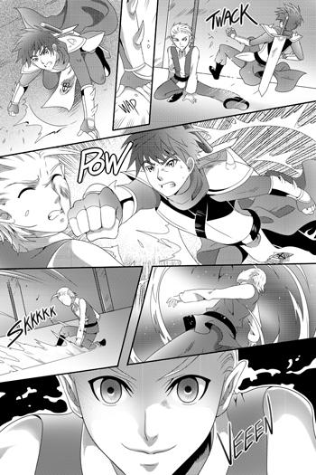
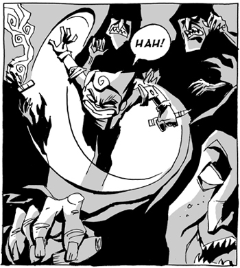
We spoke specifically on whether to screen tone or shade when doing black and white comics. With Pinocchio Vampire Slayer Dusty used screen tones and with Knights of the Living Dead he used shading. If you are not familiar with “screen tones” it is a tool used on art programs that makes shading quicker and easier by creating a large blanket of dots or cross hatched lines. This produces the desired shading effect without having to actually color and shade each page. Many artists will use this to reduce cost for black and white pages. Because shading a black and white page often takes the same time as using full colors which many artists charge a different rate for.

Often screen tones work fine especially when high quality printing is done, but sometimes they can leave a little to be desired. In general I feel the toning style does not matter if the story is great and the rest of the art is clean. Here are some examples of screen tones vs shading in black in white, which do you prefer?

Comic Toning

Comic Shading

Also you can check out Dusty’s work at SLGcomic.com

Madison Hawthorne is a comic enthusiast and writer based in Pittsburgh, PA. Madison’s comic “King of Sweden” is available at Amazon.com

Great Comic Action Panels – Madison Hawthorne

Hello ALL WIP Readers.

This will be my first article as I gear up for Dragon-Con in Atlanta on Labor Day weekend. If you don’t know what Dragon-Con is, it is a convention for sci-fi fantasy, comics, manga, anime and all things that are awesome. I will be filling you in on the convention after I have attended. Because I will mostly be spending my time in the comics area of the convention I thought I would touch on what makes a good fight scene in comics. More specifically what I feel the artist needs to do make a good action scene. Take a look at some of my favorite action pages, below.

Pacing: When I see an action scene, to me there is nothing worse than a fight that is not paced well. Sometimes an artist crams so much action into the page that the scene is over before it starts. Or on the other hand the artist stretches every single movement out so that scene drags on and on. It is important the artist captures the important points of the fight and is able to convey the emotions in the fight. That is what is most important in pacing a fight scene.

Comic Action Panel 2
Movement: Because comics are done in pictures it is important that speed lines and other additions are added to each panel so the action is easy to follow.

Comic Action Panel 1
Background: Background is important because it brings clarity to the fight, if people are jumping around or moving in a scene then the background should adjust. Often the background does not vary enough, so it looks the entire fight takes place within 8 square feet.

Comic Action Panel 3
Those are the three things that I feel are most important when making a fight scene.

Madison Hawthorne is a comic enthusiast and writer based in Pittsburgh, PA. Madison’s comic “King of Sweden” is available at Amazon.com